Swiftsplash
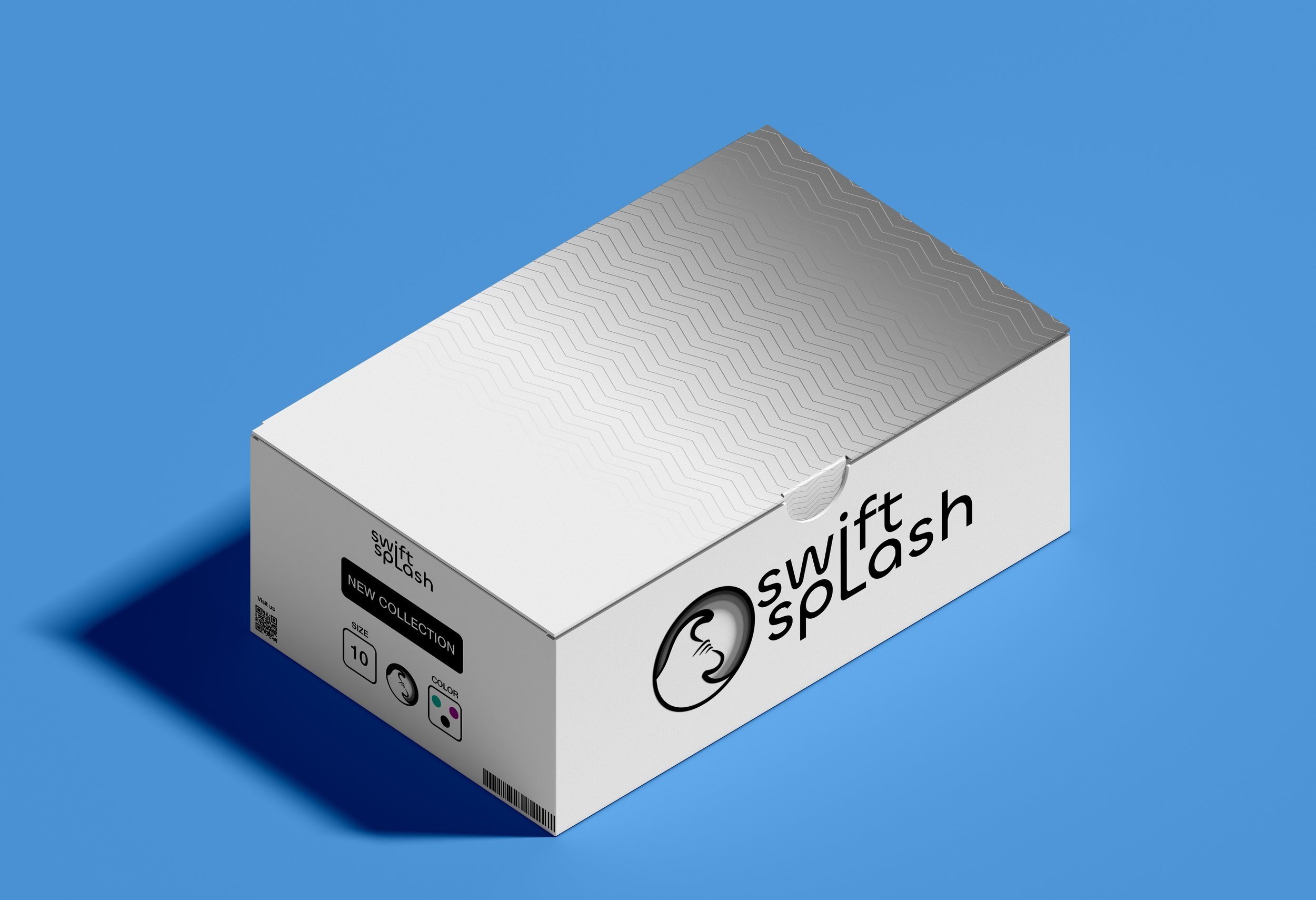
A company focused on creating great quality running equipment got in touch with us and tasked us with creating a new logo and merchandise design that would better represent their brand. The logo creation process took a few attempts, as the client had requested some "hidden" elements to be included in the design (don’t worry we’ll show them later in this post). Once the final logo was agreed upon, the design team moved on to creating merchandise designs, with the shoeboxes being the big ticket item.
The focus was shifted toward the shoes, which Swiftsplash wanted to make the star of the show. As such, the decision was taken to make the merchandise and packaging visuals look neutral, but stylish, in order to help their upcoming line-up of shoes stand out. Since their main brand colour is grey, our job was made easier and after a couple of quick calls, the final design emerged and Swiftsplash loved them. Overall, the project was a great opportunity for us to flex our creative muscles and create designs that convey a sense of quality without being overly flashy.

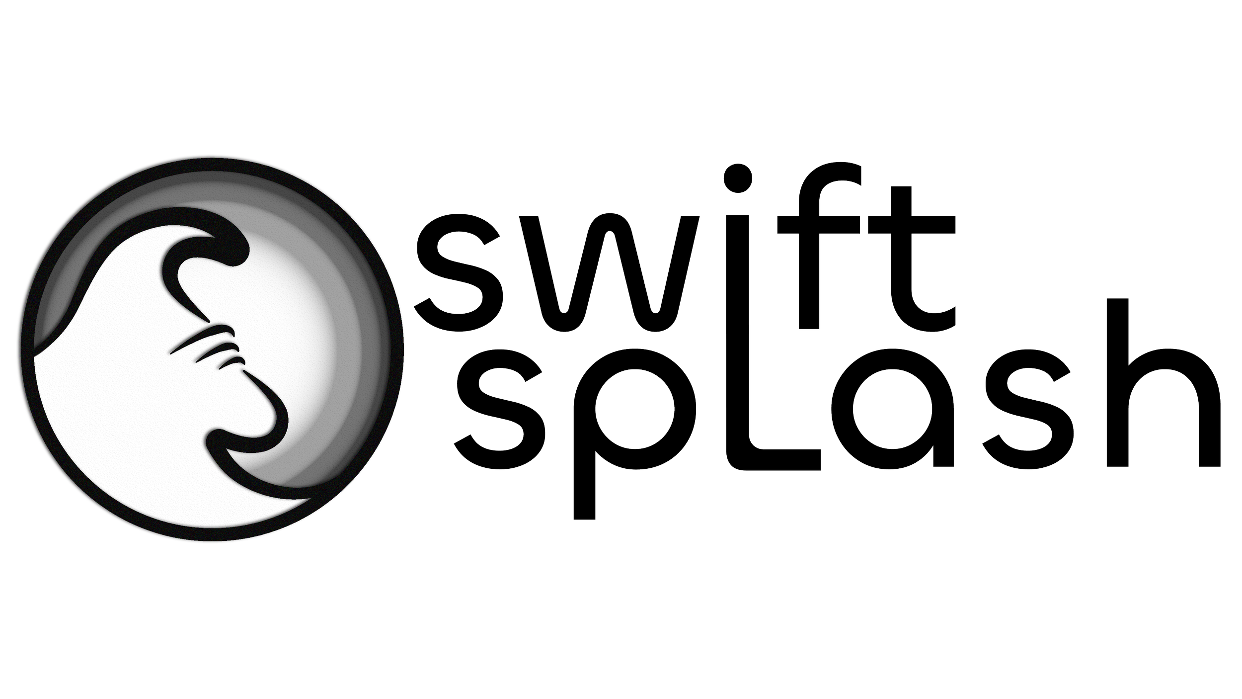
Going to the name of the brand and the client’s request for the logo to have more meaning to it, we came up with the idea of making a literal splash, and what better way to show that than using waves as the main motif. We traced the outlines of two waves and joined them together in order to create a balanced design, also the two waves join together to create a monogrammed “S”. Since S is the main letter of the words making up the brand name, Swift-Splash, we just had to make it one of the centre points within the composition.
Looking more at the two waves joining together, we couldn’t stop noticing the outline of a shoe taking shape. So, we thought of a few options to make the outline pretty obvious, especially since the company’s main focus is on its state-of-the-art shoes.
Ultimately, we got straight to the point and added the outlines of the shoelaces, which absolutely got the point across and added more depth to the logo.
The final addition to the logo were the ripples, just like someone would see on the surface of the water when an object disturbs it. These ripples would be coloured using the client’s choice of grey and made to also resemble somewhat of a spotlight, so the eye is drawn towards the centrepoint.


